There are symbols that do more than simply represent an institution; they embody its deepest identity, becoming a visual synthesis of values, vision, and commitment. The logo of the Simone Cesaretti ETS Foundation belongs precisely to this category, as it embodies a true cultural manifesto. Nearly twenty years after the Foundation’s inception, this emblem continues to convey, with surprising relevance, a concept of sustainability that has never been static but is constantly evolving, capable of engaging with the challenges of the present and the future.
Far from any superficial interpretation, the logo encapsulates a complex concept, born from a profound reflection on the role of the younger generations, the importance of values, and the need to build a balanced model of development. Understanding the meaning of this symbol, therefore, means entering the heart of the Foundation’s mission and grasping its consistency over time.
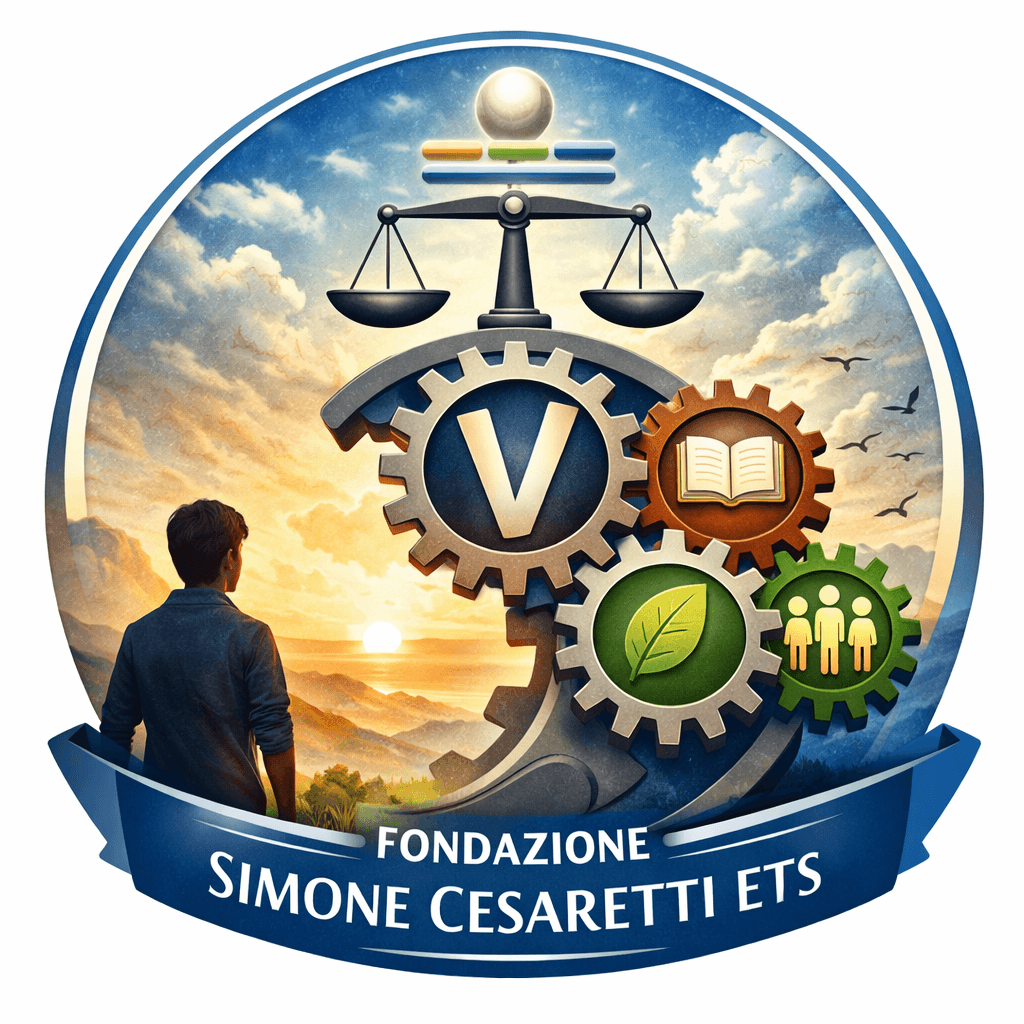
The young person and the horizon: a vision grounded in solidity
Far from any superficial interpretation, the logo encapsulates a complex concept, born from a profound reflection on the role of the younger generations, the importance of values, and the need to build a balanced model of development. Understanding the meaning of this symbol, therefore, means entering the heart of the Foundation’s mission and grasping its consistency over time.
The young person and the horizon: a vision grounded in solidity
At the base of the logo lies a simple yet powerfully evocative figure: a young person gazing toward the horizon. Is it a random or purely aesthetic image? Absolutely not. It is a deliberate choice that places new generations at the center as protagonists of change.
This young person is not portrayed in a state of uncertainty or instability. On the contrary, their gaze is calm, projected toward the future with confidence. Here emerges the first level of interpretation of the logo: the ability to look ahead depends on the strength of the foundations upon which one builds their path.
The Foundation identifies these foundations in the four pillars of sustainability: knowledge, values, respect for the environment, and participation. These are not isolated concepts, but structural elements that must coexist and reinforce one another. Without this solid base, the future appears fragile, uncertain, and difficult to sustain.
From this perspective, the logo takes on an almost pedagogical dimension: it suggests that the well-being of new generations cannot exist without cultural and social investment in these pillars. It is an implicit invitation to create conditions that allow young people to recognize themselves in the proposed development model, avoiding phenomena of disengagement and marginalization.
Gears and Pillars: Sustainability as an Interconnected System
The conceptual core of the logo develops around the image of gears, inspired by the mechanism of a clock. Here, the metaphor becomes even more refined: sustainability is not a set of juxtaposed elements, but a dynamic system in which every component is interconnected.
The initial gear, symbolically marked by the “V” for values, represents the spark that sets the entire mechanism in motion. This is far from a secondary choice: values are not an accessory element, but the essential starting point. Without them, the system does not activate—it remains inert.
From this initial impulse unfolds a chain of connections involving knowledge, respect for the environment, and participation. The image of the clock thus becomes particularly effective: if even one gear stops or disconnects, the entire system ceases to function.
This vision anticipates, with remarkable clarity, one of the core principles of contemporary sustainability thinking: the interdependence between different dimensions. There can be no sustainable development without a balance between knowledge, ethics, the environment, and active community engagement.
Particularly significant is the reference to participation, understood not merely as presence, but as identification. The mention of young people who neither study nor work highlights a social fracture that risks compromising the entire system. In this sense, the logo does not simply represent an ideal—it implicitly points out a critical issue and indicates a direction: rebuilding the connection between individuals and society through an inclusive model.
The Scale and the Path: Balance and the Goal of Sustainability
If the base of the logo represents its foundations and the gears its functioning, the upper part introduces a project-oriented dimension: the path toward sustainability.
The scale is the central symbol of this phase. It immediately evokes the idea of balance, but in this context, it takes on a broader and more complex meaning. It is not only about balancing interests or resources, but about harmonizing all components of the system into a coherent project.
Each element must find its place without dominating the others. This is the necessary condition for the path to develop effectively. Sustainability, in fact, is not a starting point, but a goal that is reached through a process.
This process is visually represented by a movement leading toward a final point: the “dot,” symbolizing the ideal destination. It is not a fixed or definitive objective, but rather a horizon to strive toward, with the awareness that the journey itself is an integral part of the outcome.
Completing the picture, the four lines placed above the scale introduce an additional layer of interpretation, linked to the four forms of capital: human, natural, social, and economic. These elements represent the fundamental resources on which any sustainable development project is built.
Their presence in the logo underscores a key principle: sustainability cannot be reduced to an environmental or economic dimension alone, but must integrate all forms of capital that contribute to collective well-being. Once again, the idea of balance and interconnection emerges strongly.
The Logo as a Visual Synthesis of a Philosophy
Nearly twenty years after its creation, the logo of the Fondazione Simone Cesaretti ETS continues to stand as a symbolic device of extraordinary relevance. It is not merely an identifying element, but a visual synthesis of a complex philosophy, capable of combining theoretical rigor with strong communicative power.
In a context where the word “sustainability” sometimes risks being emptied of its meaning, this symbol restores depth and concreteness to the concept, reminding us that it is grounded in values, knowledge, participation, and respect for the environment—and that it requires balance among different forms of capital.
The logo thus becomes a compass, a constant point of reference that guides the Foundation’s activities and ensures their consistency over time. Above all, it represents a message addressed to new generations: the future can only be faced with confidence if it is built on solid and shared foundations.
The original values not only endure, but grow stronger, demonstrating that the vision that gave rise to the Foundation does not belong to the past. Rather, it continues to serve as a fundamental lens through which to understand the present and shape the future.